Exploratory data analysis sits at the core of any insightful data work. Performing log analysis in search for threats is no different.
Data!
Whether you are a security analyst triaging alerts or a detection engineer looking for detection opportunities from logs, the ability to understand data is what determines your success.
Now that security logs are abundant, speaking to data is what sets you apart from an average cybersecurity pro with domain knowledge ‘only’.
What is EDA?
In statistics, exploratory data analysis (EDA) is an approach of analyzing data sets to summarize their main characteristics, often using statistical graphics and other data visualization methods — Wikipedia.
In the context usually covered here, mainly around detection engineering and security analytics, that’s the process of digging into log data to answer the questions we often have when facing a new log data source (dataset).
Exploratory data analysis is the discovery of trends and patterns in data using statistics and visual representations.
Many individuals in our industry already do that without knowing, myself included (a few years back). EDA is the entire process of untangling a brand new log source to figure out what’s inside!
Meet the Panda
I have recently started (formally) studying Data Science as part of a professional program at MIT. I highly recommend it! ❤️
As expected, the very first lab involves programming in Python and leveraging some of its multiple libraries available to explore data.
Turns out, the work we do when faced with new log data is not far from what data engineers or data analysts do when dealing with a new dataset.
Ultimately, security relevant logs represent a fraction of the vast array of data relevant to businesses. Nevertheless, the practices employed for acquisition and consumption are becoming remarkably consistent.
When it comes to numerical data in Python, numpy is the fundamental package needed for scientific computing among others (ex.: scypi).

Similarly, when it comes to data wrangling/analysis, Pandas is the most used Python library. However, for the record, some argue Polars might be a better alternative (check this 90 secs definition from the author).
Are you using Python (or PySpark!) in Threat Detection without being a member of a vendor (product) team? I’d love to hear from your experience as I am planning to dig that a bit more these days!
Wait, I can also Splunk that!
Back to that Data Science class, as I approached the lab exercises, I couldn’t help but think about how easy it would be for a Splunker to simply write a few SPL commands and arrive at very similar results.
So I thought why not doing that just for the kicks?
Splunk is a powerful BI/Reporting Platform
If you haven’t worked with Splunk, especially on the content engineering or analytics side, perhaps you have little idea about its capabilities.
When I started using Splunk back in 2014, the first data I picked to explore was from a PCAP file. The exercise actually resulted in a SANS paper.
While the schema-less approach from Splunk might be seen as a challenge when it comes to normalization, it’s a killer feature when it comes to fast data onboarding and consumption.
You simply throw data at Splunk and start slicing and dicing it right away. No need to comply with any schema, no need to parse or use field maps.
Still, that’s not the best thing about it as development platform. I believe the most powerful feature lies in its query language (SPL) and the ability to quickly visualize insights from data.
BTW, did you know Splunk’s mascot is a pony? Also, SPL v2 is going public soon, customers can apply for evaluating it via a beta program here.
Picking a Dataset
I cannot share the same dataset used in the MIT program, however I found a simpler but very similar one on GitHub provided by Animesh Mishra. I’m sure other similar ones can also be found at Kaggle or data.world.
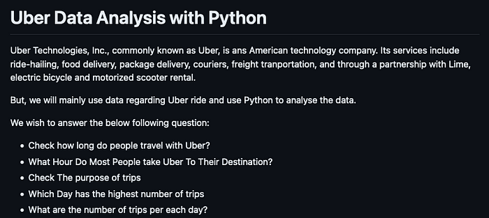
In the repository, besides the Uber Drives.csv, the author also shared a Jupyter Notebook which fits perfectly to the exercise here as it’s basically the thought process, a step-by-step on how the data was explored.
A notebook is an interactive environment in which code execution, rich text/media are combined. Google offer a great place to start on that in case you are considering experiencing it your own.
Exploring the Dataset — Python x Splunk
From this point on, I will be basically showing how it’s done in Python and then in Splunk, sometimes with extra commentary.
And before anything, this is just a fun exercise. I am by no means suggesting one can do whatever is done in Python (or any other General-Purpose Language) with Splunk.
Loading Data / Quick Look
For Python, you simply need to load the dataset in your environment of choice (VSCode, PyCharm, etc) and install the libraries referenced.
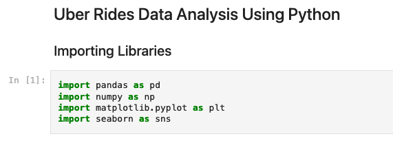
Matplotlib and Seaborn are some of the most used libraries for generating charts in Python. There are many other such as Plotly.
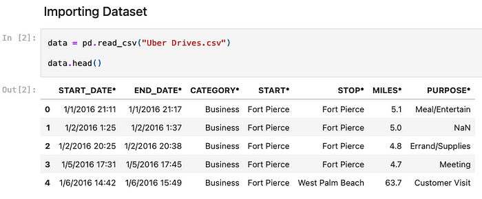
The head() method shows the first 5 rows of a dataframe (tabular data) using pandas — a very basic operation to check the contents of a dataset.
In Splunk, there are two easy ways to load a CSV file:
- Create a lookup file, which is basically a CSV file itself;
- Load the CSV into an index (defaults to ‘main’).
For the latter, simply follow Settings > Add Data > Upload menu options.
Then parse the only required field (TIME) since time is a sensitive column for this exercise. Others columns (fields) will be extracted automatically.

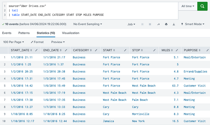
Once the data is on-boarded, simply point to the file using source key and use head or tail commands to have a quick look at the data:
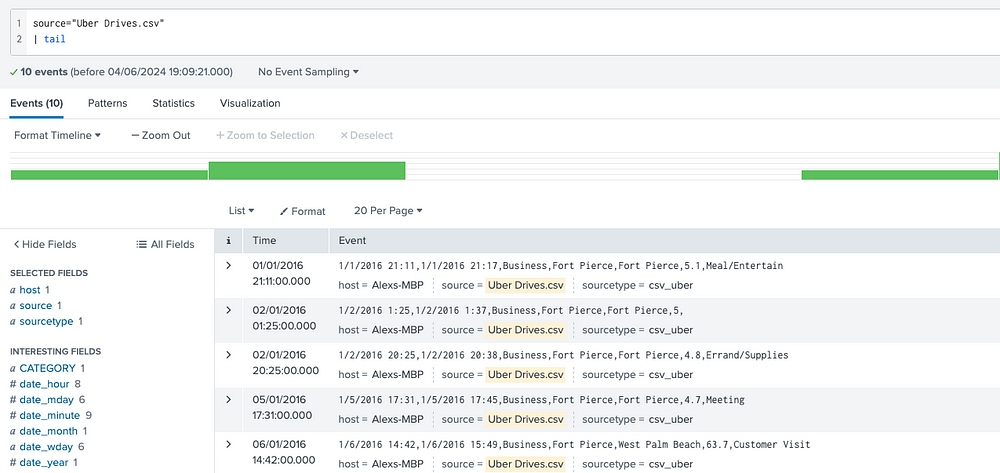
The table command formats the data in tabular instead of raw format:
Dataset’s Shape & Info
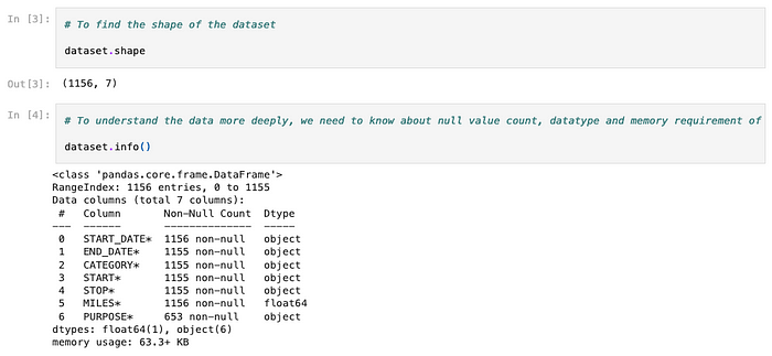
The author then verifies the number of rows and columns available in the dataset. There’s also an info() method that displays extra info including the presence of NULL values and the column types.
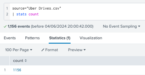
In Splunk, there are many ways to get to those results. To get the total number of rows you can simply use the stats command:
Now, to get the number of columns (also referred to as fields), you first need to remove the internal Splunk fields. Splunk offers a quick way to calculate summary statistics from a dataset using the fieldsummary command:
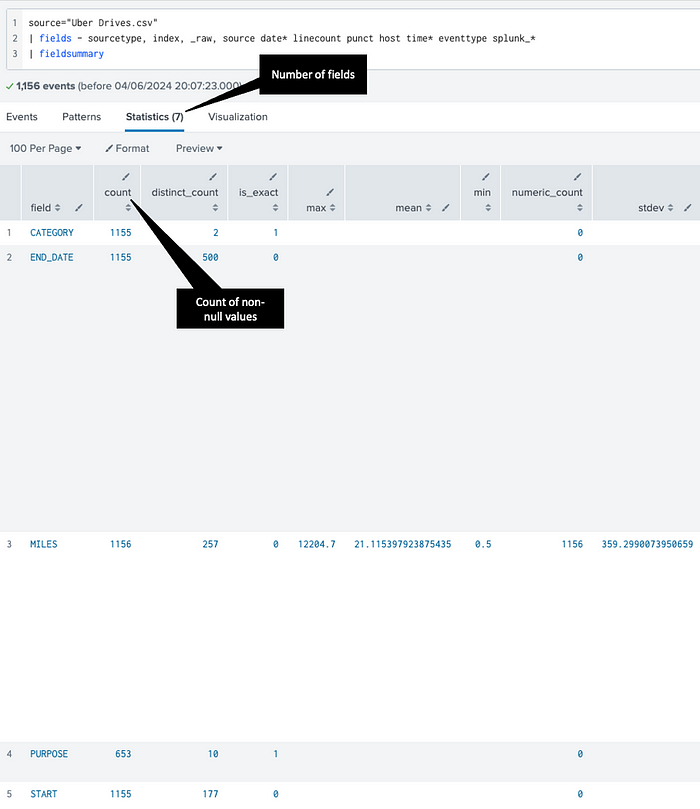
That output is also similar to panda’s describe()method.
Data Preprocessing / Formatting / Normalization
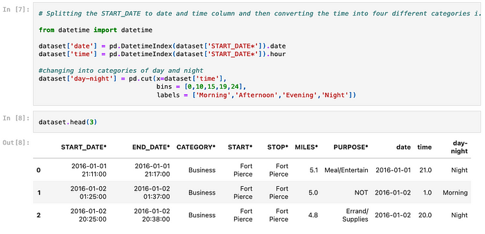
The next step in the Jupyter notebook is about handling some null values and date/time related columns:

In Splunk, there are mainly two ways to handle NULL values.
One way is to use the fillnull command:
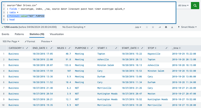
The other way is to simply check for the presence of the NULL value and then assigning the new value accordingly. For that, we use the eval command and theisnull() function:
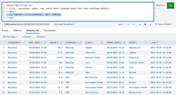
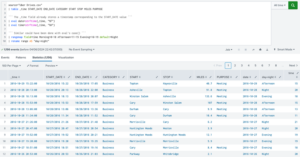
Dealing with date and time related columns and values might be done in different ways in both Python and Splunk.
Below what is included in the notebook:
Similar can be done in Splunk, of course:
Data Visualizations
The author goes on to plot two charts (countplots) using seaborn library, which is used to show counts of categorical fields:
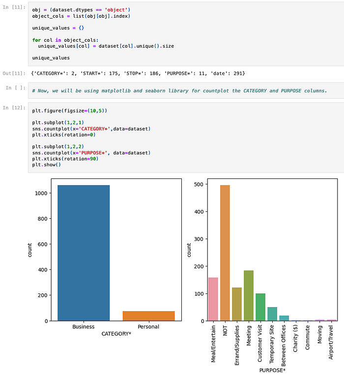
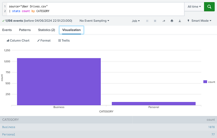
In Splunk, the same data output (result set) can be used to plot multiple types of charts. For instance, to get the count (of rows) per distinct value of CATEGORY field, the following SPL code works just fine:

Now, using the same code, simply click on “Visualization” tab and pick one chart type from the list available. In this case, we picked the Column Chart:
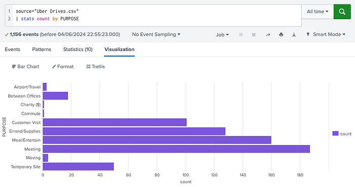
Similarly, we can apply the same concept to PURPOSE, but this time using a Bar Chart as the visualization type:
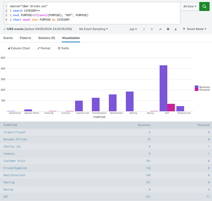
The next notebook step involves showing the counts over two categorical columns/fields: CATEGORY and PURPOSE.
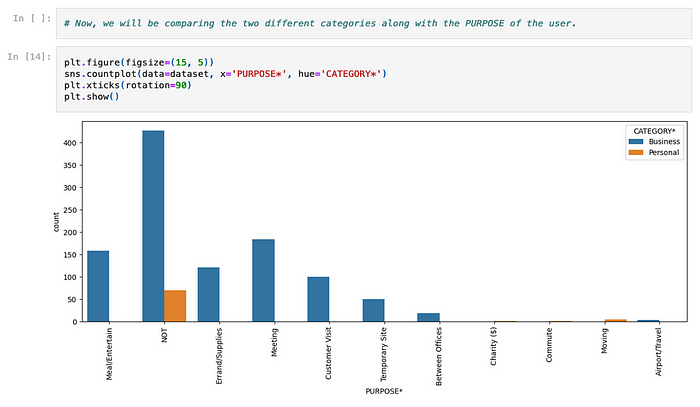
In Splunk, very similarly:
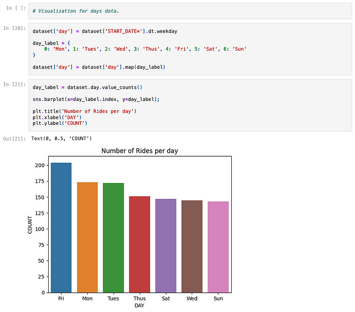
The notebook explores other basic charts such as the busiest day in the week (below), but I am sure you got the idea.
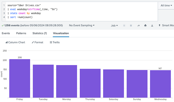
Similarly, in Splunk:
There are many other options to explore here.
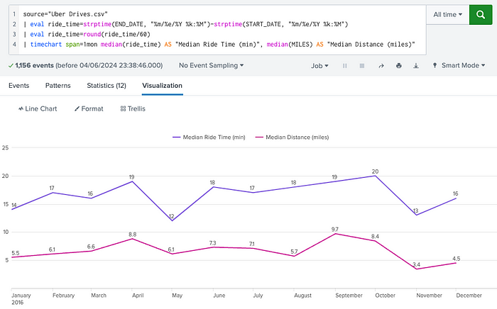
How could we visualize the obvious relationship between distance and time?
Or how to quickly visualize a heatmap depicting the most frequent routes by leveraging data points from START and STOP locations?
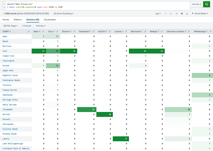
There are also Pie, Bubble, Scatter and other visualizations, including Sankey chart which is one of my favorites already approached in this blog.
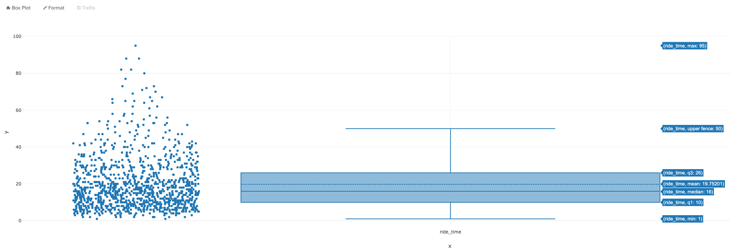
Lastly, below is an example of a Boxplot which provides a visual indication of percentiles, minimum, maximum and outlier values for the ride_time values observed in the dataset within 1 and 99 range.
It’s easy to notice that the median ride takes about 16 minutes whereas the mean (average) ride takes almost 20 minutes.
All data points are also shown on the left.
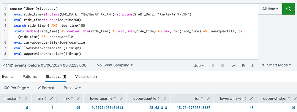
The same key values can be calculated with the following SPL, however, using charts definitely speeds up analysis (and communication).
Did I miss anything?
Feel free to reach out via LinkedIn or Twitter in case you want to exchange ideas around those topics or to provide any feedback.
I plan to share more content on ML/Analytics side as I progress with other ideas and experiments using Splunk and other data platforms.


Can you be more specific about the content of your article? After reading it, I still have some doubts. Hope you can help me.
I do trust all the ideas youve presented in your post They are really convincing and will definitely work Nonetheless the posts are too short for newbies May just you please lengthen them a bit from next time Thank you for the post
Your point of view caught my eye and was very interesting. Thanks. I have a question for you.
Dedicated to excellence, BWER offers Iraq’s industries durable, reliable weighbridge systems that streamline operations and ensure compliance with local and global standards.
Your point of view caught my eye and was very interesting. Thanks. I have a question for you.
I don’t think the title of your article matches the content lol. Just kidding, mainly because I had some doubts after reading the article.
I don’t think the title of your article matches the content lol. Just kidding, mainly because I had some doubts after reading the article.
Can you be more specific about the content of your article? After reading it, I still have some doubts. Hope you can help me.
Your article helped me a lot, is there any more related content? Thanks!
Your article helped me a lot, is there any more related content? Thanks!
Thanks for sharing. I read many of your blog posts, cool, your blog is very good.
Your point of view caught my eye and was very interesting. Thanks. I have a question for you.
Thanks for sharing. I read many of your blog posts, cool, your blog is very good.
Thank you for your sharing. I am worried that I lack creative ideas. It is your article that makes me full of hope. Thank you. But, I have a question, can you help me?
Your point of view caught my eye and was very interesting. Thanks. I have a question for you.
Can you be more specific about the content of your article? After reading it, I still have some doubts. Hope you can help me.
Thank you for your sharing. I am worried that I lack creative ideas. It is your article that makes me full of hope. Thank you. But, I have a question, can you help me?